JESSICA GANTIER


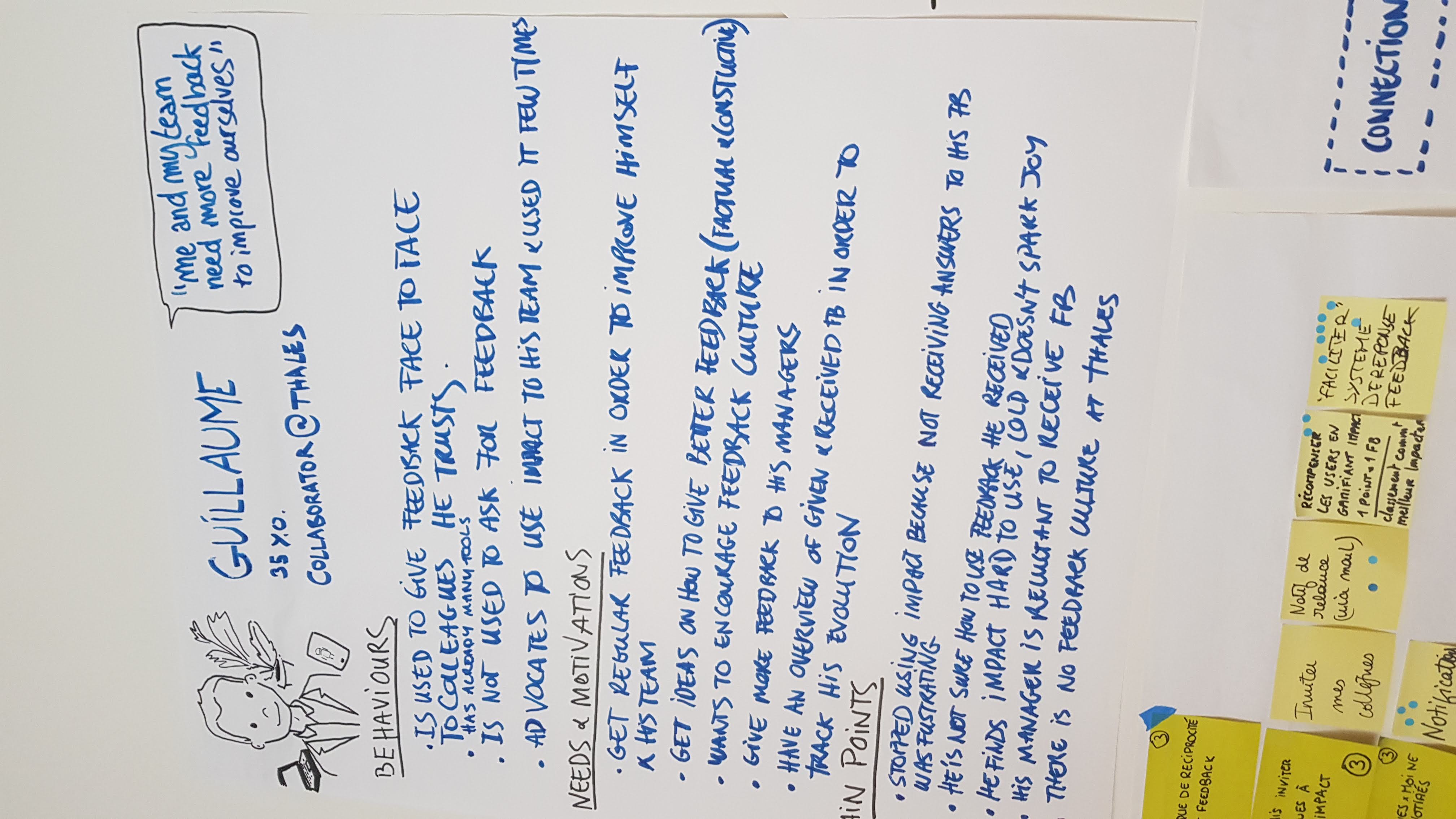

IMPACT helps focus on what matters and grow professionally by easily collecting feedback from different sources and tracking progression overtime.
1. No reciprocity, no response to my feedback, no notification when I do receive some.
2. If my colleagues stop using the app, there is no point for me to keep on using it.
3. IMPACT is hard to use and not intuitive.

Users raised a large range of usability and discoverability issues with the existing app. We decided to tackle navigation and information architecture first as its seemed to have the most negative impact on user adoption and retention.


Labelling main nav items helped features discoverability, We had 90%success rate when users guessed what that section was about.
Current users were used to having navigation options on the bottom
The idea of having a « notification center » as main view of the app confused and disappointed
Old version

New bottom navigation

New account section

We did 1 to 2 weeks iterations for design and research. Before interviewing users, we listed the assumptions we were trying to test with each round of interviews. After evaluating how they performed we made decisions about what we wanted to keep, kick or change in each iterations.

Fix or implement email, push, and in-app notifications.Suggest clear actions in each notification.

Organised all feedback (sent, received and requested) in the same thread rather than as different entries.


Users can thank colleagues that sent them feedback and ask for more information


The idea of a “fake bot” adding comments and suggesting actions within a conversation thread.Users were uncomfortable with having a third party suddenly appearing in a private exchange. It also created lots of confusion about who was talking.
Give a fresh and friendly first impression.
Respect at least AA accessibility standards
Capitalize on front-end framework already used: Material angular


Illustrations played an important role: they set a friendly but serious tone. The imagery is about people, exchanges and dynamic interactions. Reassuring and inspiring empty states serve discoverability as well: they welcome new users and guide them with clear actions to take.

Current app layout and navigation did not adapt to larger displays.
We fixed this by adapting navigation and optimizing layouts for desktop viewports.

Orange Entreprise - Online Assistance
Prestashop - Design system